Client page 2.0 / April 2022
Easy client management, all in one place.
Background
Pleo is an expense management solution for forward thinking teams. Employees make expenses, admins review them and bookkeepers handle the rest. As for accounting partners, they empower their own clients with Pleo's smart company cards.
Created in 2020, the partner portal was built as a simple gateway for partners to access their clients' Pleo accounts.
What's the impact?
- 20% increase in feature usage, frequency and time spent in portal
- 16% increase in number of new partners within the first 6 months
- 17% increase in number of partner clients referral within the first 6 months
How did this come about?
There was an increasing demand to grow partnerships as another distribution channel for Pleo. In order to increase the number of client referrals, the product needs to grow so that partner bookkeepers can manage the larger number of clients.
Convince the partner, convince the client. Partner bookkeepers have to engage with the Partner Portal to discover its additional value before they feel convinced to refer more of their clients to Pleo. Ideally, they should find the Partner Portal so useful that they want most of their clients on there.
Is this a real problem?
The Partner Portal was originally created without any product or customer considerations in mind. Given that the client page is the core and first page partners land on in the portal, it needs additional value for partner bookkeepers. If the client page can provide significant value for their workflows, they are more likely to use the portal beyond just a simple gateway to client accounts.
The easier it is for partner bookkeepers to manage their clients, the less time they would need to spend in the product. This means we are helping them save time, save their clients money and in return, further build on that trust between partners and their clients.
How do our customers feel?
Working together with the User Research team, interviews with partners from various markets were carried out with two objectives in mind:
- To understand how to enhance the user experience of the client page to increase engagement amongst partners
- To better understand the roles of a partner admin and employee in an accounting practice
Key takeaways from our customers were:
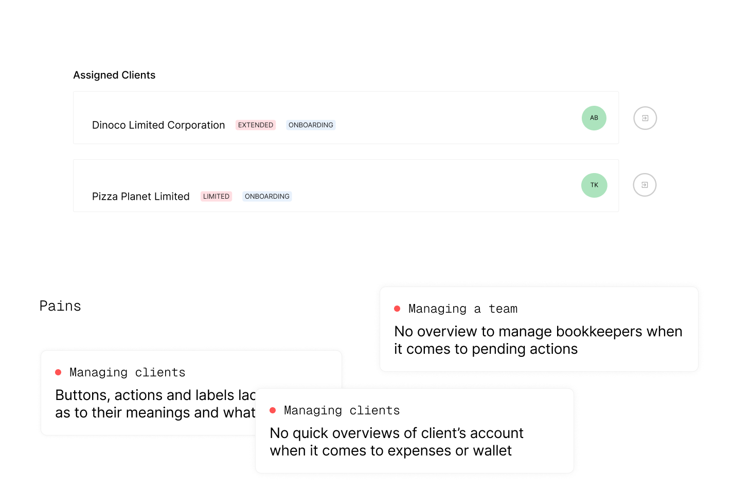
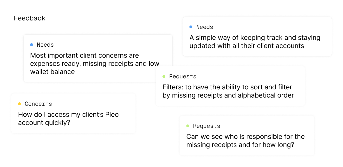
- The ‘Client’ page is not used as a tool, but rather as a means to an end.
- Partners want an overview that allows them to quickly identify pending actions for their client accounts.
- Partners are most concerned with expenses ready for export, low wallet balances, missing receipts and the accounting tool that a client uses.
- Partners need different access for different roles - admins and employees.
Admin, SMB Accountancy (UK)
... if you give that overview, you can nag your team a bit more and make sure that they do the things on a daily basis. I can have a look and check whose wallet balance is low so that we can top up the wallet before they get an alert or before they try spending and there's no money.
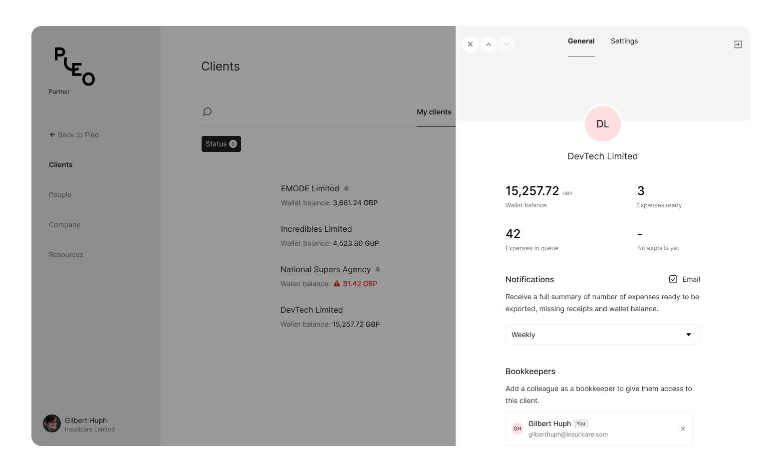
What's the MVP?
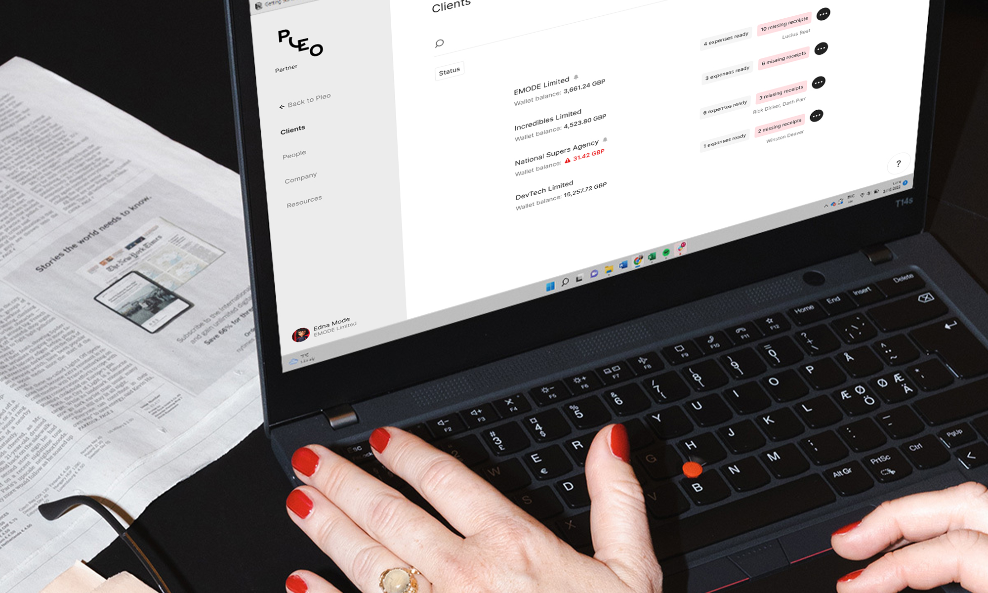
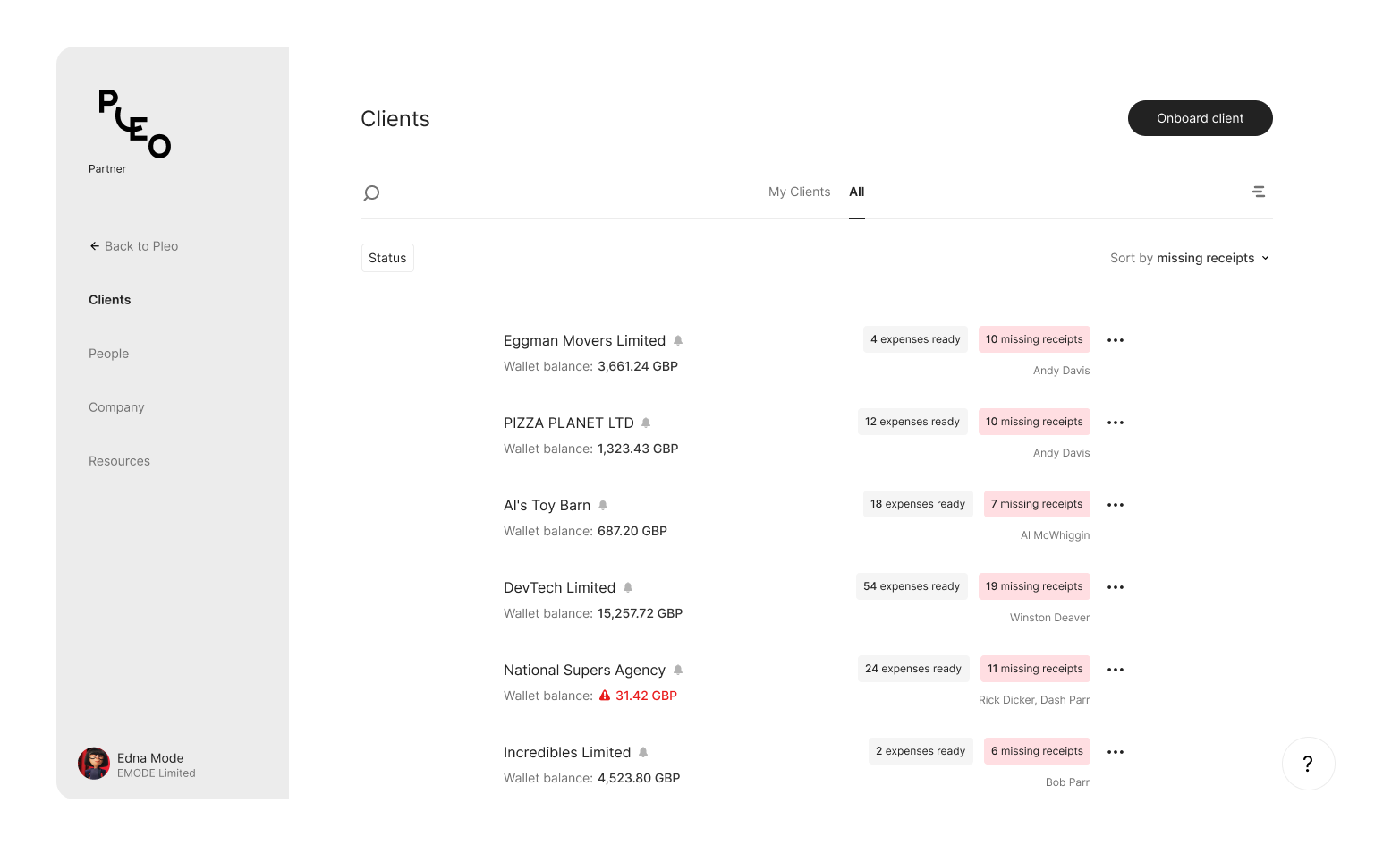
When partners log in, they should land on a main page that shows an overview of the clients they personally manage, as well as clients managed by the rest of the team (for admins). A client's wallet balance, missing receipts, expenses ready and bookkeepers assigned are all included in the initial overview.
For actions or a detailed overview of the client account and settings, these are contained in a drawer which still allows the partner to retain the view of the main client page, but be able to view further information. The introduction of opt-in email notifications meant that the partner could always stay updated with their clients' accounts and resolve any pending actions so that they were also one step ahead of their clients.

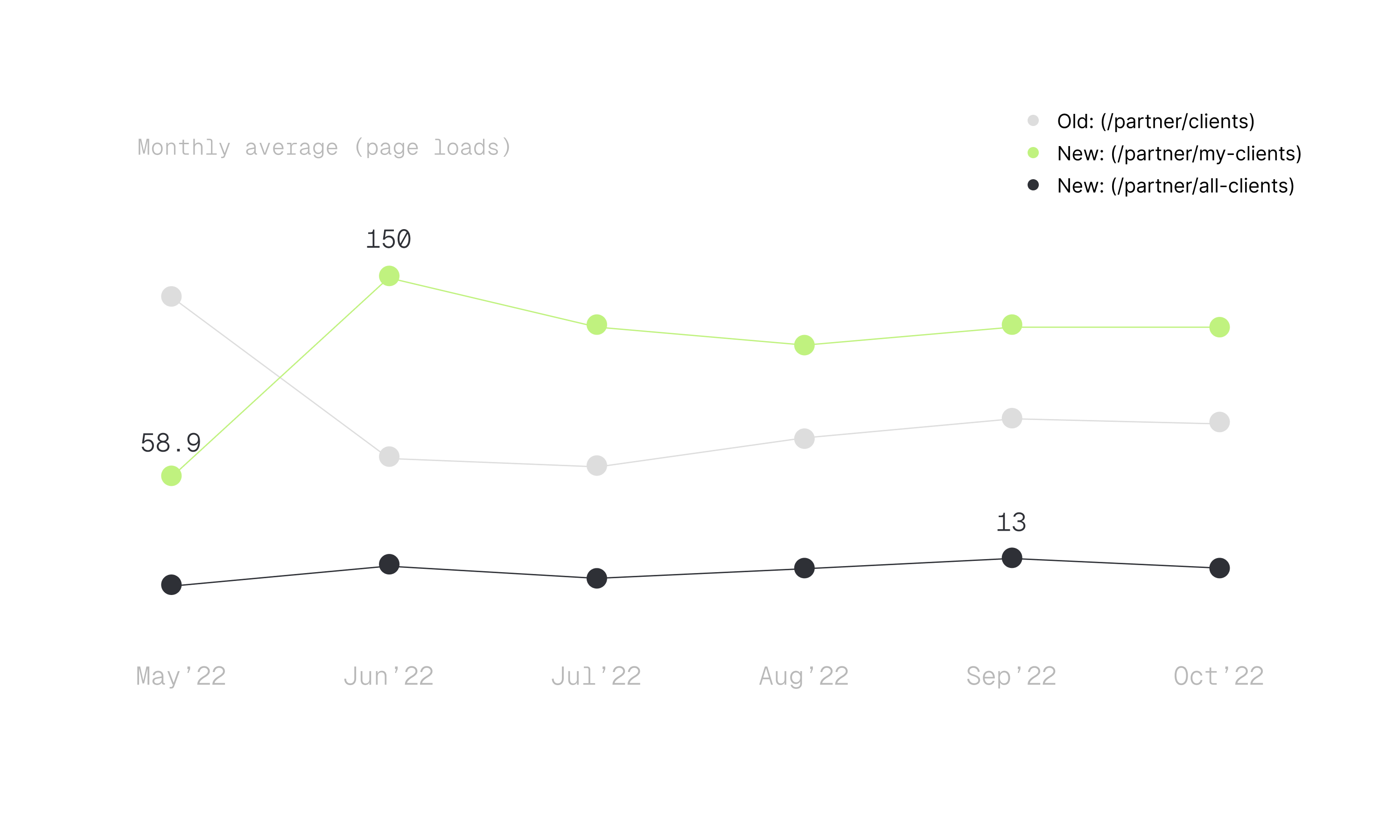
How did we do?
Upon the release of the new client page, tracking was implemented to compare the older and newer versions. By the second month, the new client page had outperformed the old version by more than 100%. By the fourth month, the gap between both versions had decreased but the new client page still retained more views than its predecessor.
Nothing is quite "final", is it?
Post release of the new client page, one recurring feedback was that partners were unaware that they had to be assigned to a client prior to having access to manage their account. After adding a tooltip that appears on hover over the disabled state, it still did not solve the problem as partners did not hover long enough to notice the tool tip, got frustrated and had to call for help.
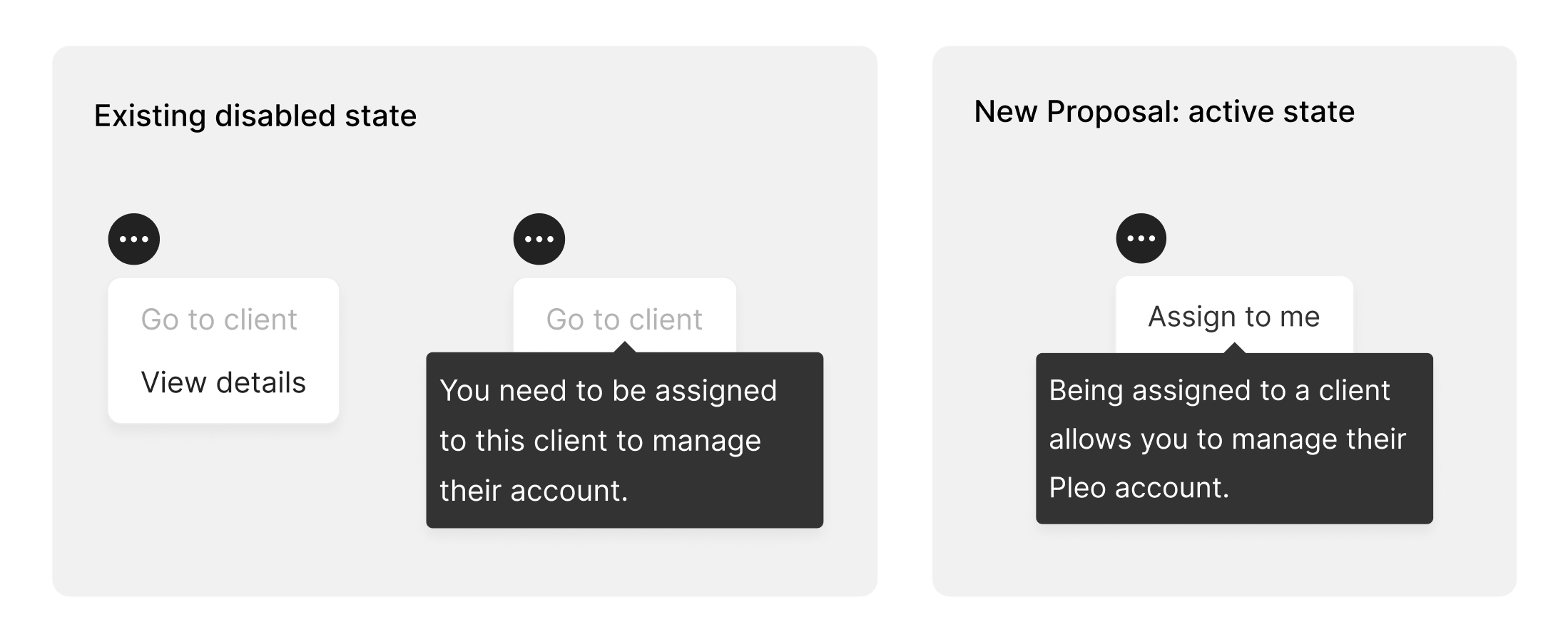
Be proactive instead of reactive. Disabled states were transformed into actionable states. Instead of informing them what they had to do first, this can be reflected directly in the button action. As soon as they assigned the client to themselves, they could then manage their client's accounts. Once this improvement was live, the original problem was resolved as there were no further struggles with partners accessing a client's account.